What are you gonna see?

You will discover with us why people don't trust in a website despite all the company's attempts to build trust and how we propose to solve it.

Scope

Improve the conversion rate

After the first research we focus our efforts in understand the client and how to build trust with they strengths.

Role

UX/UI Designer

User Research,

UX strategy,

Visual design, Prototyping & Testing.

Time

10 half days

We made a 10-day plan that we had to adapt almost every day, but we were clear about how we wanted to tackle it, 8 days of research and 2 days of graphic design execution.

Team

4 people

Linda, Edu, Leo and myself. As a team we worked like a clock, the respect we feel for each other fuels the team and makes us enjoy the whole process, put in extra hours and end up with a result that would be impossible without this team.

Main problems

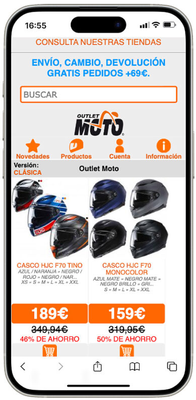
The website of Outlet moto is a total mess, doesn’t reflect the values of the company, has a lot of heuristic problems and makes the whole experience a very difficult path to buy a product. With the result of low trust of new consumers

What causes and why is that?

One person does everything related to ecommerce, design, marketing programming and has to prioritize

Brand values are not defined

Business strengths are not reflected on the website

Goal

The goal is to build consumer confidence.

And we will do this by solving heuristic problems on the web, reflecting the brand's strengths and optimizing the buying process.

Keeping in mind the essence of the brand that has been established for more than 25 years in the market.

Context

Outletmoto is one of the biggest and most successful outlets related to the whole motorcicle world in Barcelona. With discounts up to 70%. Stock Liquidation of outdated products. They send worldwide.

Before and after

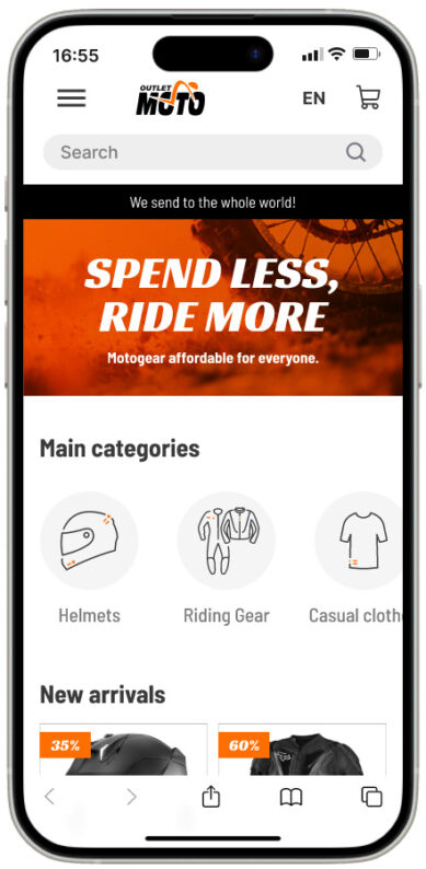
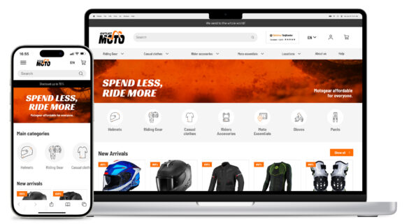
After analyzing the website, we found a lot of heuristic problems and a chaotic website that didn't inspire trust. After interviewing the stakeholders and a thorough analysis of the brand, the physical store and the competitors, we organized the information and built a new website. Keeping in mind the type of business (an outlet), the customer we are reaching (looking for a cheap products) and the most important things to the stakeholder (easy to buy and inspire trust).

Why we did what we did?

The goal of the project is to extract the good parts and reflect the company values in the website, fix the heuristic problems and make the e-commerce more efficient.

Understanding the CLIENT

After interviewing the e-commerce manger we understand a lot of things.

They know what they want

"We need a website where the products are clear and easy to find. Show that we ship around the world with trustworthy payment methods."

The main problem of the client has is the lack of resources, there is only one person doing all the job, design, developing the website, marketing and social media.


Understanding the BRAND

They have been selling in the physical store for almost 20 years, they know they customer and tried to reflect that in the website.

But in the website they have a problem

The brand shouts "TRUST ME" in every corner of the website, which creates the opposite feeling in the customer.

The brave person who buy in the website is always satisfied and we need to exploit that. Because the service is almost perfect.

The actual reviews

13.877

people interviewed

The score

4,8/5

Womeninterviewed


Understanding the CUSTOMER

Our customers are looking for a bargain.

They are worried about safety.

Looking for a trustworthy website.

Insight

People trust what they can understand.

The problem

Outletmoto needs a way to convey trust online, because customers are currently unsure whether to trust them and make a purchase.

The translation: Our customers don't feel comfortable on the website and don't trust it. And we need to transform the website into a trustworthy one so that our customers can have the same feelings they have when they visit our physical store.

Let's find the path

Our Insight

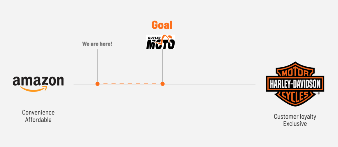
We found a niche that we think Outlet Moto fits into,

being cheap but customer centered.

So we decided to move the brand to there.

Focusing the brand

Our first thought

After the initial analysis, we thought they didn't care about their users at all, just focused on selling no matter what. But we felt something was wrong. And after the interview we found out what their real focus was.

After understand the brand values

They focus on one thing Selling things that are affordable for everyone.

Moment to take some decisions

Without losing brand values and customer needs, how do we make the site trustworthy?

Making the web understandable

Adding information hierarchy

Simplifying categories

Redoing the user flow

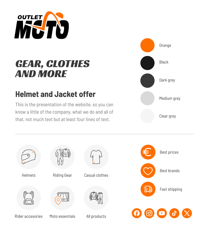
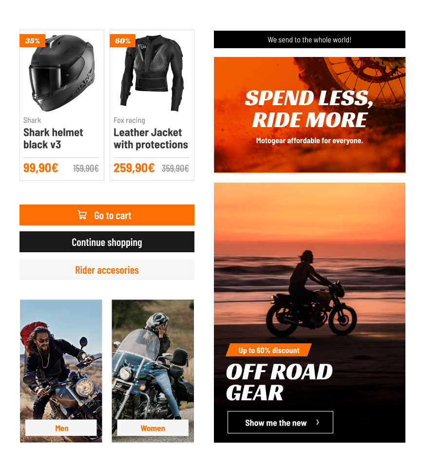
Matching the brand values with the visuals

Simplify the best way

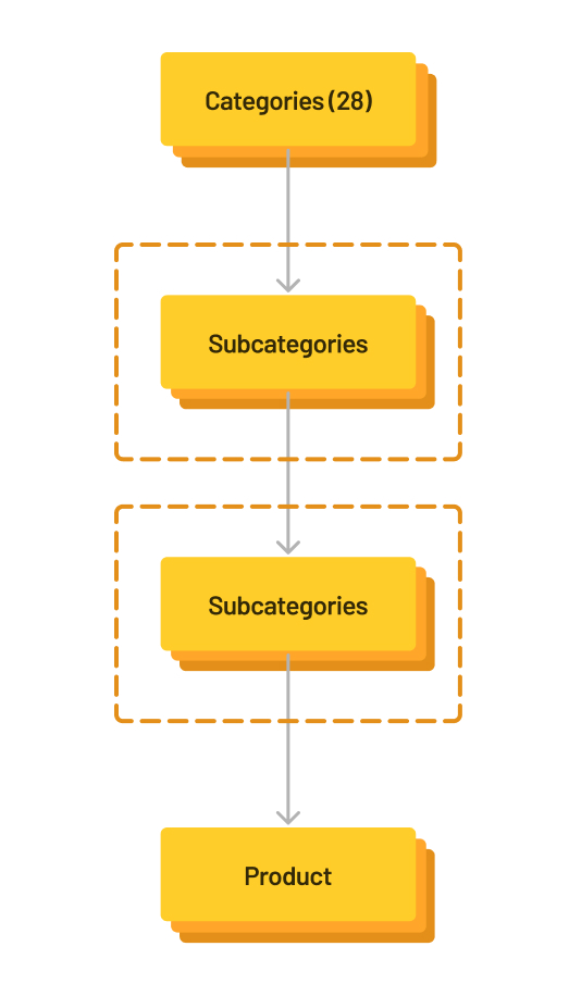
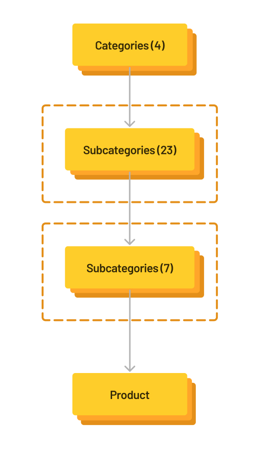
We started to understand the mail categories and subcategories so that we can differentiate the products in the easiest way. This allows us to have less information in the home page and make the smoothest path to the user.

Previous main categories

28

New main categories

4

Style tyle


Sections and changes


Buying process

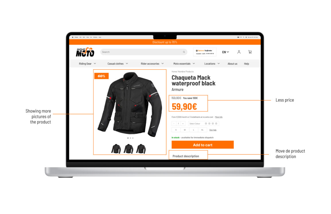
To help our client to improve the conversion rate, besides creating more trust we improve and simplify the buying process by making the information as clear as possible and solving all the pain points we detected in the actual website.


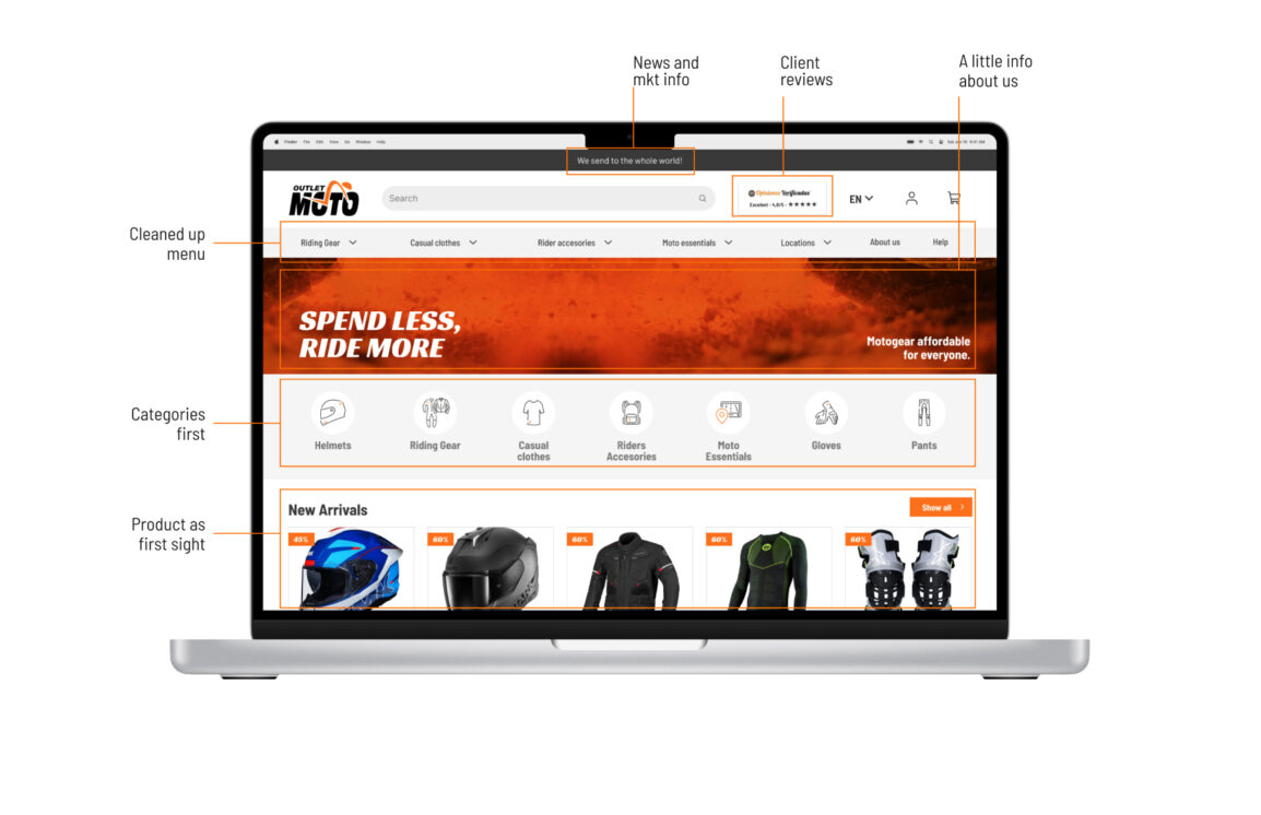
The homepage has all the trustworthy points we detected in the research. Also we simplified all the information and visuals. Providing the brand more consistency and personality.

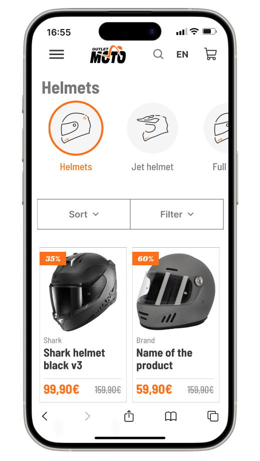
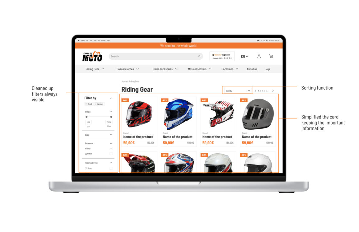
We applied categories simplification, added filters and sorting and a bubble filter selection to help the users to find what they are looking for.

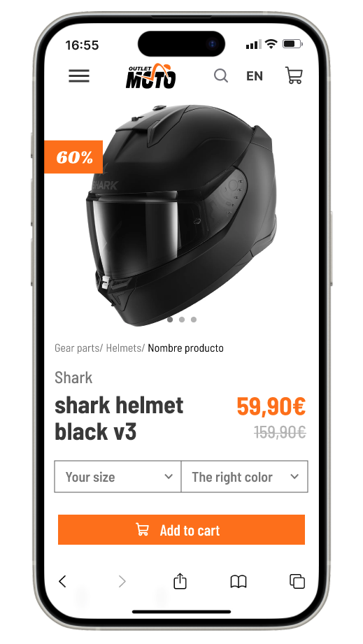
The product page was one of the most important for us. We put in front of the user all the essential information and the add to cart button. You can buy in just one screen and if you need more information you can scroll.

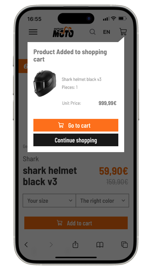
We added a popup showing you interaction when you add something to the cart. And you can decide go to cart or continue shopping, the popup closes after 6 seconds.

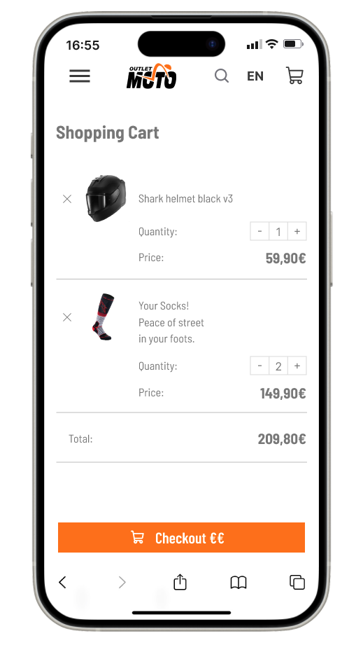
We simplified the shopping cart with the products and the total. With the next step adding related products to help the cross selling.

The final result

The end result reflects all the research we did in the first 8 days. And turns it into actionable items that can be seen in the prototype.


The biggest challenge was to maintain the outlet image. Trying not to lose that characteristic language, taking into account the user and understanding their needs.


To solve the biggest problem, which was the lack of trust in the website, we kept a consistent image, gave the brand a personality and added the necessary information so that people would have the confidence to buy in the store.


To increase the conversion rate, we focused on the steps and the simplicity of the process, that there were no problems and that everything was clean, simple and easy.

Test the mobile version


Learnings
The most important part of this project was really understanding the business in terms of sales and how they'd built trust with their customers despite all of the website issues. At some point in the process, I tried to grasp the client's vision and extract those parts to preserve it in the final result. It might not be the most beautiful website, but it's exactly what they needed!

Last but not least, I would like to point out the beautiful experience I had working in this team, the nourishing feeling of pushing each other's boundaries with care and love. Just to go one step further with fun and laughter.

Case study

More information


If you want to see the raw information and have a step by step during the process you can see the full case study here.

See more projects

Everyone has a past, and I'm proud of mine

Graphic design, packaging, websites and art direction

A small selection of my journey of visual design, conceptualization, project management and art direction.

Lancefree

Starting as a freelance never was so easy

We have found a way to guide you through the almost impossible journey of registering as a freelancer in Spain.

Roda Cosmetics

Increase conversion with UX strategy

We increased conversion through website confidence building, heuristic approach and marketing techniques.

Everyone has a past, and I'm proud of mine

Graphic design, packaging, websites and art direction

A small selection of my journey of visual design, conceptualization, project management and art direction.

Lancefree

Starting as a freelance never was so easy

We have found a way to guide you through the almost impossible journey of registering as a freelancer in Spain.

Outletmoto

Improve conversion rates through trust

Reflecting corporate values, improving the e-commerce, fixing heuristic problems and making the purchase easier.

Roda Cosmetics

Increase conversion with UX strategy

We increased conversion through website confidence building, heuristic approach and marketing techniques.

Let's connect!

Call me!

+34 679 66 41 82

Stalk me!